 (1500 x 500 px)")
COLOR | BOLD COMBINATIONS. No other design element has the power to take people on a journey like color. With it we give context. We set moods. We inform attitudes and declare what emotion is being conveyed. Color resonates and connects. It contrasts. It can break a pattern. Or set one. Color can be an accent to draw the eye or take a supporting role to serve as a backdrop giving everything else the spotlight. Heck, color even becomes another color when placed next to another color. How’s that for versatile? As designers, we can wield color like a maestro conducting the orchestra, using it in every way to create a sense of place like nothing else. From accent colors to shades of another, we’re keeping our eyes on some emerging trends in 2025.
 (1500 x 500 px) (8)")
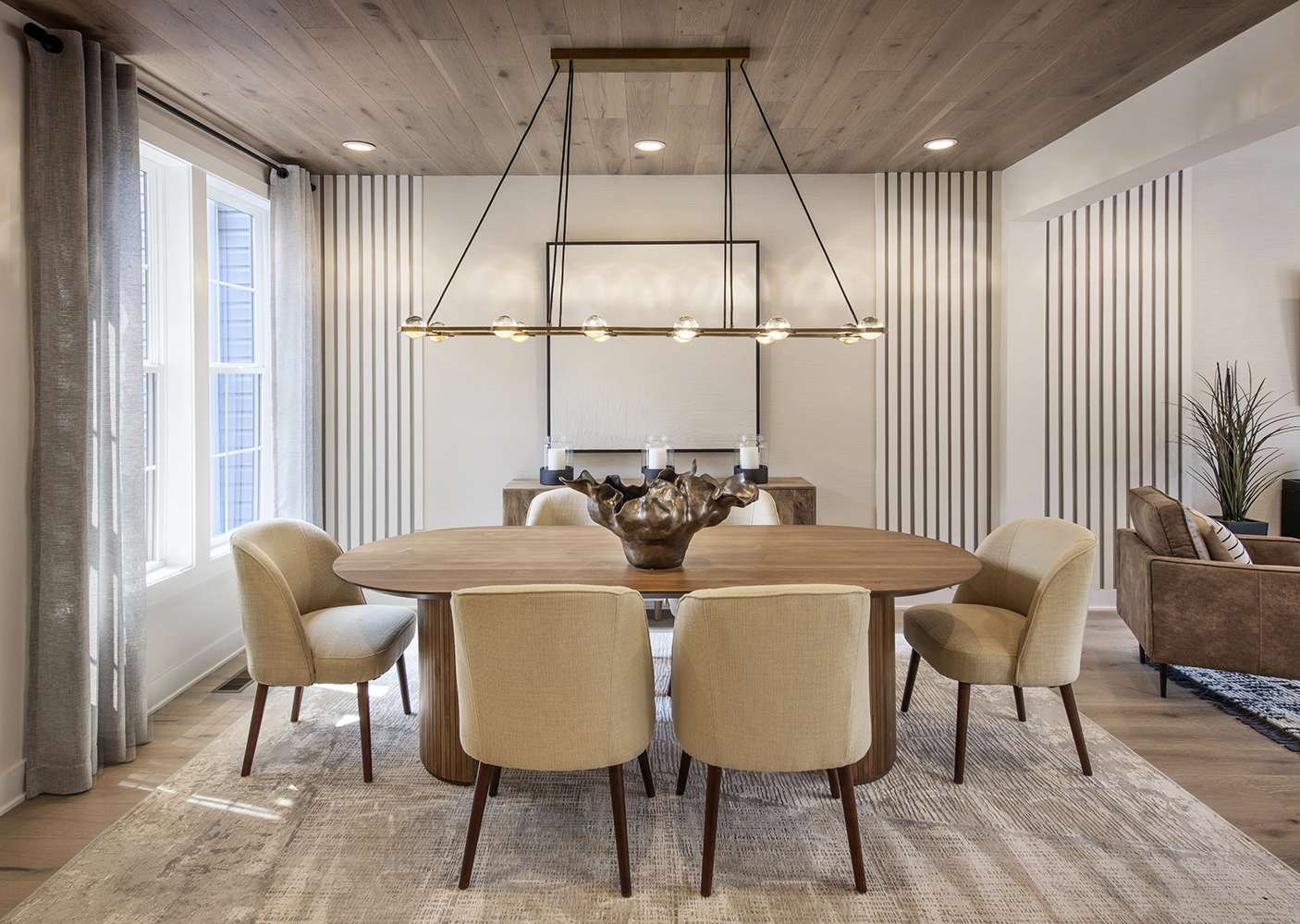
BROWN IS THE NEW GREY. Fifty shades? Really? How about a countless number of options when it comes to the new grey, “brown”. In 2025, we will see multiple shades of brown to grey claim the title of the color that goes with everything. With all the various shades and tones that brown offers, we will begin to see this color show up in every area of the house. Part of this trend is due to more people wanting to blend the great outdoors and bring it inside. From deep browns to cinnamon, brown reminds of the land, natural beauty, or the soft touch of leather. Shades of brown are inherently grounded in nature and brings an organic sensibility to any space more than grey every could.
 (1500 x 500 px) (5)")
WE SEE YOU GOLDS AND ORANGES. Want to call attention to something? Call on golds and oranges. Beyond the obvious shine and bright accents these colors offer interior designers, they are a wonderful contrast when moments of energy are needed. Using different shades of gold and orange, we can create incredible depth within any room, bringing hints of surprise and delight and creating balance within a concept. In 2025, there will be a movement toward the use of brighter colors and less muted design palettes, as we see golds and oranges appear in the private spaces, bringing a vibrant aesthetic to areas traditionally reserved for darker, more reserved hues. In summary, a rich earthy brown can be paired with classic neutrals and accents of green and orange to create a new, fresh direction.
 (1500 x 500 px) (9)")
NATURAL, BUT NEVER NEAUTRAL | TERRACOTTA AND EARTH TONES. Not exactly rustic, but certainly offering a nod to earthy environments, terracotta and other Earth tones will be making their way to the forefront of interior design in 2025. Bringing a sense of the ground, stone, and fired clay, these soft colors offer interior designers and homebuilders a way to warm up any room. Paired with other colors, terracotta reflects an invitation to enter and relax. As we see people making their homes the place to gather, this welcoming color creates an atmosphere that neither draws attention to itself nor disappears from the overall design concept. Terracotta presents a tone that gently reflects many shades of skin, bringing a touch of humanity to every experience.

THE COOL FACTOR | BLUE IS EVERYWHERE. Blue. There’s nothing to be sad about with this color. In fact, in 2024, we’re going to see this color – everywhere. With so many shades and so many uses, blue works everywhere. Want a room and the people within it to relax? Go Blue. Looking for a color to bring a sense of life and tranquility? Blue, again. Trying to bring depth like the ocean to space of any size or shape? You guessed it. To be sure, blue isn’t a new leading color by any means. However, as more people seek to focus on wellness and make their home a place of rejuvenation, after a very stressful last few years, it will prove to be the main color for this year. No matter how you present it, blue, and all its adaptable nuance, gives everything you need to make a space everything it can be.
 (1500 x 500 px) (10)")
PASTELS AND MELLOW COLORS | THE ULTIMATE TEAM PLAYERS. If there was ever a color palette that combined well with others, the one that includes pastels and mellow colors would be it. Soft by their very nature, these colors let all the design elements in any space like artwork, furniture and flooring take center stage. In 2024, we will continue to see these tried-and-true colors make their mark, by standing out while blending in. Offered in every shade, designers and homebuilders can create any concept imaginable, knowing that the peaches, lavenders, baby blues and pale mauves of the world have their back. Their ability to create a soft, delicate, and relaxing atmosphere makes them a trend that will never go out of style.
For every dark shade of color, there is a wonderfully bold, spectacular opposite. Being able to harness this balance is what will make the most difference for designers in 2025. Creating harmony with hue and tonality invites the homeowners and their guests to play along, welcome a new perspective, and be moved – even while sitting still.